
Slides that present themselves: The assertion–evidence approach
A simple design framework that will massively improve your slides and your public speaking
Your slides are not your talk. A strong speaker can take almost any slides and turn them into an engaging presentation. In fact, a strong speaker can hold an audience enthralled without any slides at all.1 And yet, slide design matters. Bad slides can get in the way of giving a good talk, and excellent slides can elevate your presentation. Also, importantly, the right slides can help you if you’re sometimes struggling as a public speaker. Here, I will present a simple design framework that takes but minutes to adopt and that will massively improve your slides and your public speaking.
I am writing this primarily for scientists presenting research results. However, the principles discussed are general and also apply in many other settings, such as business talks, motivational talks, or—if you ever get the chance to do one—TED talks. Anybody who needs to present in front of an audience will likely benefit from the ideas discussed here.
Let’s begin by looking at a typical slide I’ve seen in countless scientific presentations. This is a bad slide. See if you can figure out why. (Spend some time looking at the slide and contemplating any issues it may have, before proceeding to the text below it.)
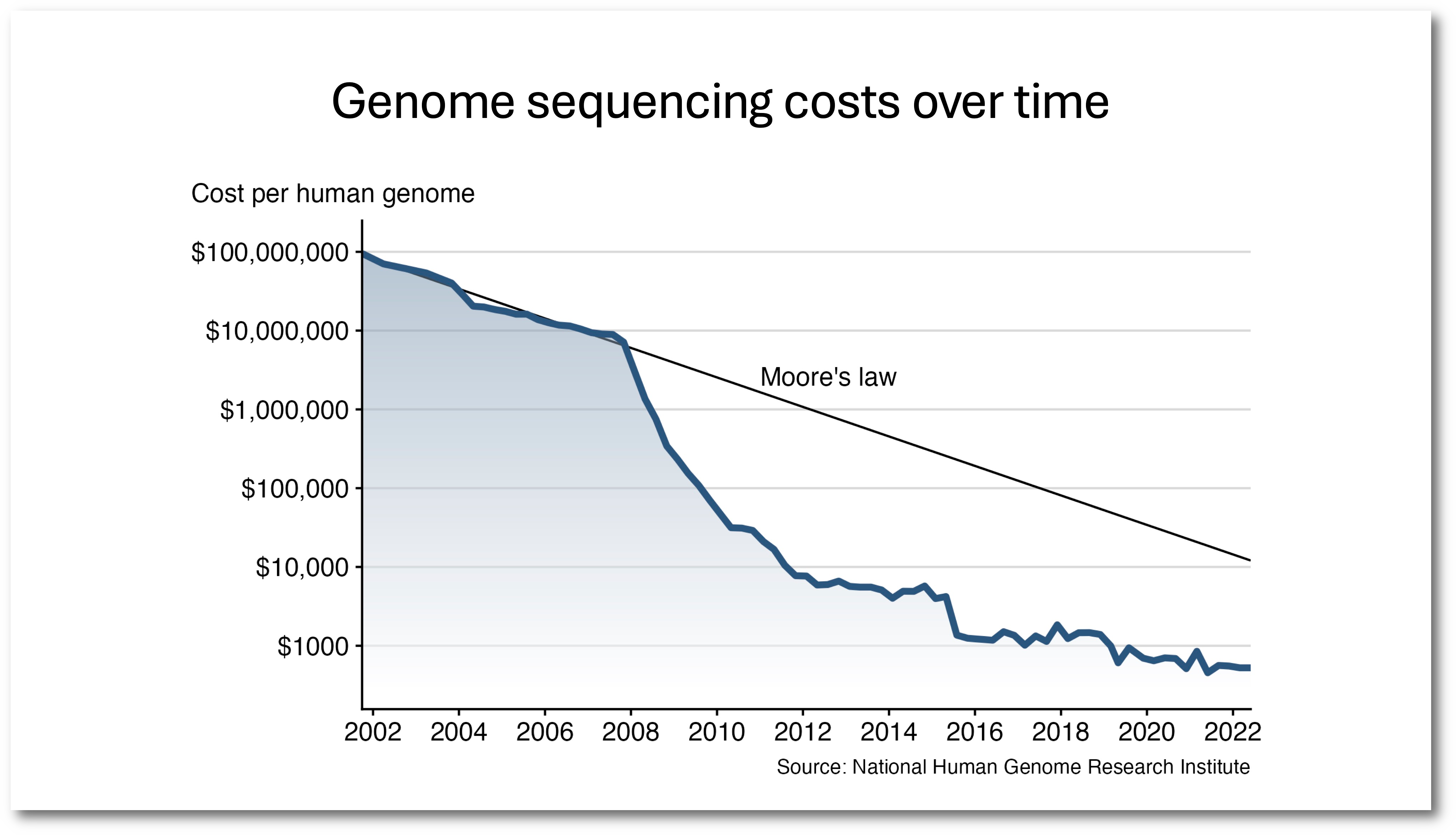
The main problem with this slide is that we don’t know its purpose; the slide doesn’t steer the audience towards a particular thought or conclusion. The generic title consisting of a short topic phrase,2 “Genome sequencing costs over time,” doesn’t tells us what we should think about the graph that is shown. So our mind is allowed to wander; we are invited to draw our own conclusions. And as we do that, we’ll likely stop listening to the presenter.
There is a simple fix that turns this into a much better slide: Replace the title with a concrete statement summarizing the main point of the slide.
Now we know the point of the slide, and by looking at the plot we can assess whether we agree or disagree with the statement in the slide title.
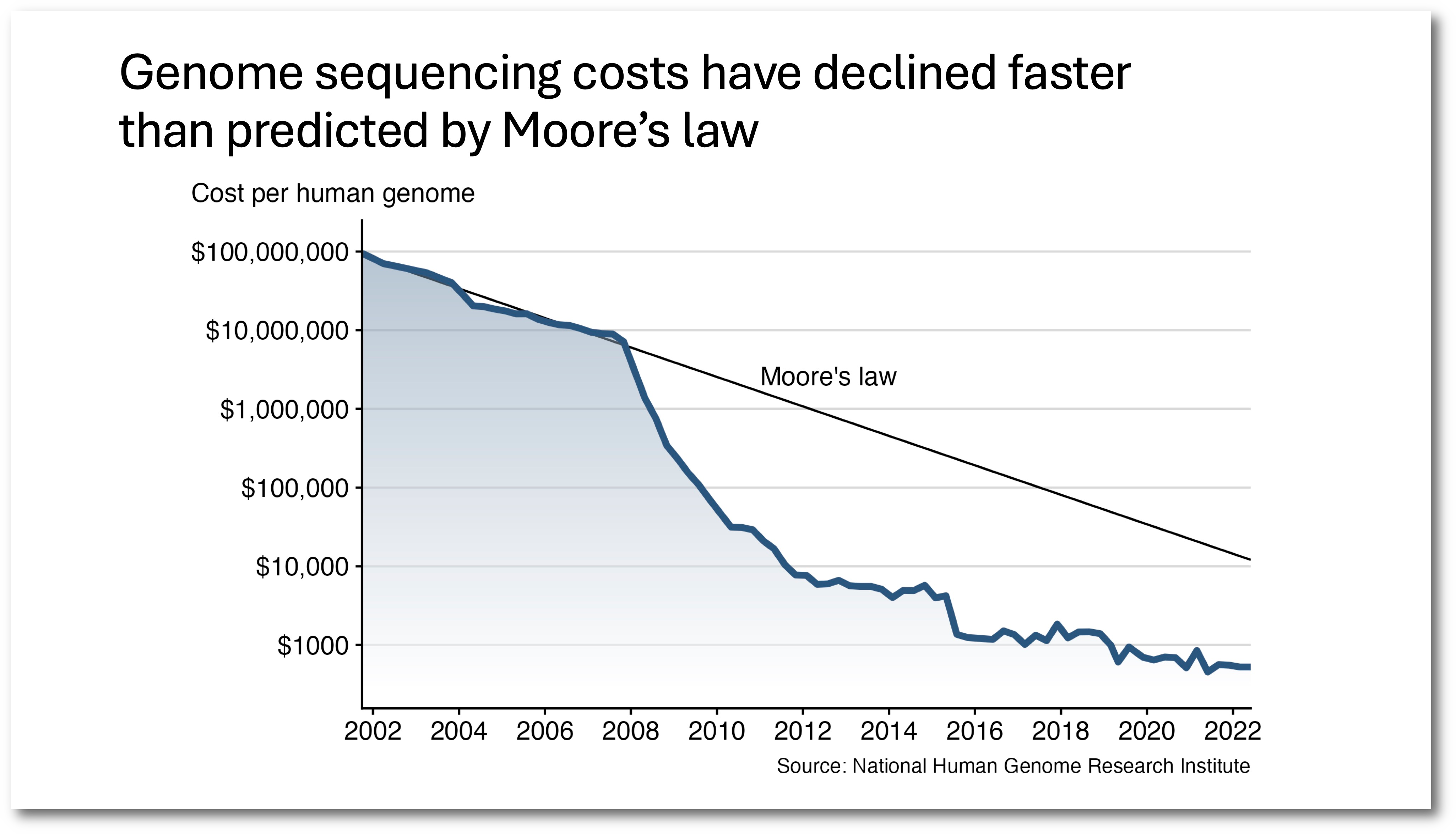
There’s a name for this type of a slide. It is called an assertion–evidence slide. The title makes an assertion, and the body of the slide provides the evidence that backs up the assertion. Here’s another example of such a slide.
The assertion–evidence approach has been popularized by Michael Alley of Penn State. He has written a book about the topic (Alley 2013; The Craft of Scientific Presentations), and he also has set up a website providing extensive examples and videos of speakers using this framework during their talk: www.assertion-evidence.com. While Alley has coined the term assertion–evidence approach, the concept itself is much older. For example, in his book, Alley cites an article from 1978 that gives similar advice.3
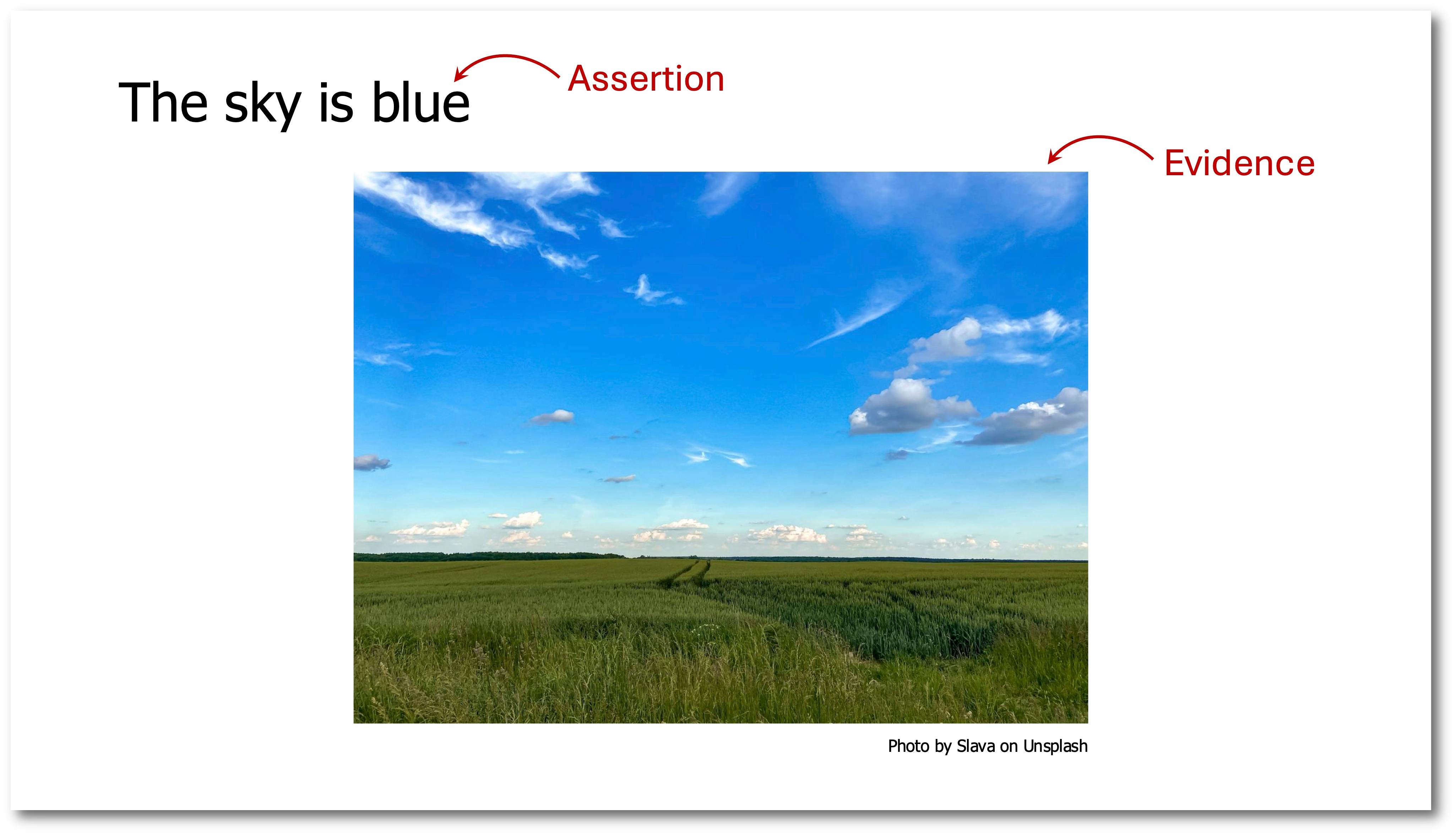
You may not see the big difference between a slide entitled “The sky is blue” and one entitled “Color of the sky,” both with the same landscape picture used as evidence. But I can assure you the difference is massive. The assertion title only allows one possible conclusion to be drawn from the evidence. The topic-phrase title allows for many different conclusions. To highlight this fact, let’s go back to the slide about genome sequencing costs. I have made four additional variants of this slide, all with different assertions. So we have five assertions total, and all of them are supported by the same evidence.
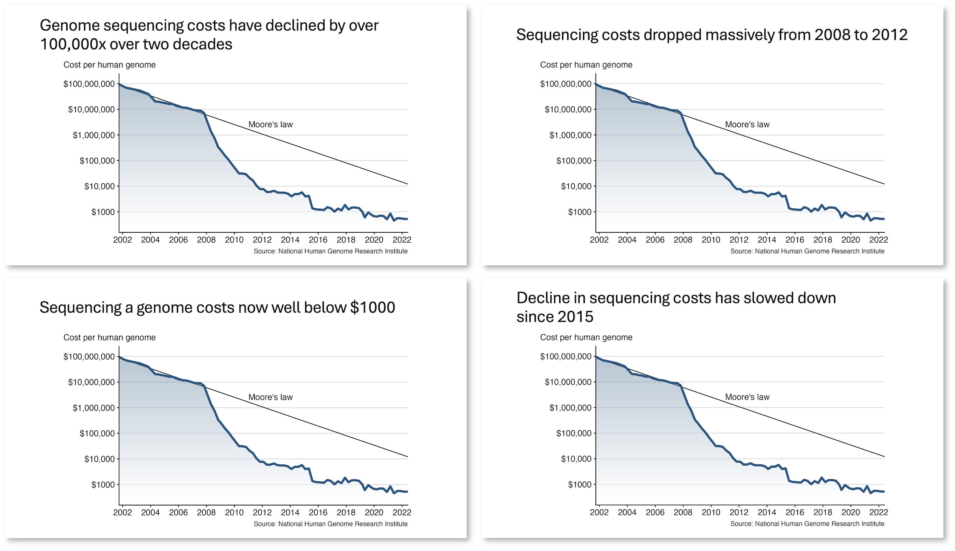
Which assertion you want to pick depends entirely on the story you want to tell. For example, compare “Sequencing costs dropped massively from 2008 to 2012” and “Decline in sequencing costs has slowed down since 2015.” Both are true, and yet they almost make opposite statements. Many graphs or other pieces of evidence, in particular the non-trivial ones, will allow a wide range of different conclusions to be drawn, and your audience will ponder all of these different conclusions unless you tell them exactly which point you want to make, with the assertion in your slide title.
There are additional advantages to the assertion–evidence format. One is that members of the audience can catch up if they stopped paying attention for a moment. If an audience member has tuned out for a bit and then tries to get back into the talk, and sees a slide with an assertion, they can immediately understand what the current point is that is being made. If instead they see a topic phrase as a title they may be confused and remain so until the talk ends.
Another advantage of assertion–evidence slides is that they help the speaker not get lost. Have you seen presentations where the speaker advances to the next slide, looks at it, and seems confused? I’ve seen it far too many times. People get confused about why they put a slide into their deck or what they wanted to say. The reasons are many. Maybe they are nervous and have just temporarily lost the ability to think clearly. Maybe they have not sufficiently prepared for their talk. Maybe they have deviated from their original script and now no longer know how to fit the slide into what they’re talking about. In either case, speakers get confused when the slide itself doesn’t make a strong point, so the speaker has to try to interpret its meaning in the moment. With assertion–evidence slides, the speaker always has the fall-back option of just reading the slide title (the assertion) and then spending some time explaining how the evidence supports the assertion. Even a speaker who has completely lost track of the storyline or is highly stressed and anxious should still be able to read the assertion and present the evidence. So, in a way, assertion–evidence slides present themselves. As long as the assertions are sequenced in such a way that they tell a coherent story, almost anybody can present an assertion–evidence slide deck, with very little practice.
However, please don’t take this post as arguing that every single slide needs to be in the assertion–evidence format. For some types of slides, the format simply isn’t a good fit. For example, overview or summary slides would likely be awkward if you tried to squeeze them into the assertion–evidence format. I see assertion–evidence slides as my bread-and-butter slides. They make up the bulk of my slide deck and are the main go-to when I need to present results.
Let me close with some advice on formatting. First, keep your assertions short. They should take up at most two lines of text. I can’t tell you why, but from looking at thousands of slides I feel confident that two lines of text is fine but three or more is not. Somehow the human brain can perceive up to two lines of text as a single unit that doesn’t require much effort to read, but the moment text runs into a third line it feels like a paragraph that needs to be scanned. Second, if your assertion is too long to fit into two lines, edit it to become shorter; don’t reduce the font size. You want the same title font size across all slides in your deck.4 Third, left-align the assertion, don’t center it. You may be tempted to center the assertion if you think of it as a slide title, but it is not. It is a statement that is placed where otherwise the slide title would be. Again, I don’t exactly know why, but experience shows centered assertions don’t work well, in particular if they span two lines. Finally, you need to pick the right font size for your assertions. Make the font large enough that it can be read from a distance, but not so large that the text overpowers the slide. While in general people seem to have a tendency to make fonts too small,5 for assertions at the top of slides I see the opposite problem just as frequently, where fonts are definitely too large. In particular, the default PowerPoint font size is probably too large. Many ready-made slide templates use font sizes that would be appropriate for short topic phrases as titles but are too large for full-sentence assertions.
Think comedians: On Netflix, you can find numerous hour-long recordings of people just standing on a stage talking, without any slides whatsoever. Most of this content is really engaging.
I’ll refer to short titles that merely describe the topic of a slide as topic-phrase titles.
R. E. Perry, "Audience requirements for technical speakers," in IEEE Transactions on Professional Communication, vol. PC-21, no. 3, pp. 91–96, Sept. 1978. DOI: 10.1109/TPC.1978.6593157.
It bothers me to no end that PowerPoint and other presentation tools automatically scale the title font size when the title is too long to fit into the available box. Whoever implemented this feature is completely ignorant about design.
This is a problem in particular for axis labels and legends in graphs. Those fonts are almost always way too small.
Your design instincts are right on. There is research that supports your formatting suggestions. Centred text is always more difficult to read (as we read left to right in English). Our eyes don't have to work so hard when the text is always in the same spot on the left. And keeping titles the same size across slides is a visual cue readers use to understand the content of your presentation (which ideas are important or of same weight) so it's very important to keep fonts the same size across your slides as you rightly suggest.
Yes A-E framework holds the audience brilliantly.