
If you’re an experimental scientist and you dare to visualize your results without showing error bars you’ll immediately get challenged. “Can you show some error bars please?” “Did you do any replicates?” “Is the result significant?” But add in error bars and the objections melt away. All is good in the world. World peace achieved. Children in Africa fed and clothed. The visual appearance of error bars calms people’s minds and assures them good science was done. Error bars are opium for the scientific mind.
The one thing you must never do is ask what the error bars actually represent. There be dragons. Ask five different scientists what quantity you should use to generate the error bars and you’ll get five different answers: Plot the standard deviation; plot the standard error; plot the 95% confidence interval; plot the range; perform a Bayesian analysis and plot the 95% credible interval. The list of possibilities goes on and on.
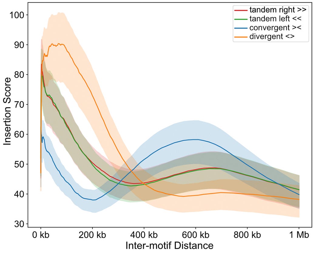
The dirty truth of error bars is there is no generally accepted quantity they should represent. You can plot whatever you want. I personally think that the standard error is the right choice, but I’ve been in this business long enough to know that what I think is irrelevant. Plenty of people do not plot the standard error, or would be hard pressed to even explain what the standard error is. If you see error bars and you think “standard error” you’ve spent too much time in stats class and not enough time in the real world. People chose an experimental science because they weren’t that excited about stats. Do you really expect them to remember the definition of the standard error?1
The most common mistake I see is people plot the standard deviation instead of the standard error. How is this a mistake, when I just said “you can plot whatever you want”? It’s a mistake in the sense that standard deviation does not represent an error. So if you intend to show an error, and you plot the standard deviation, you have not achieved your stated goal. It’s shocking how often I’ve talked to even senior scientists who were confused about this topic. These days, if somebody is not a professional statistician, I’ll just assume they don’t know the difference between standard deviation and standard error.2
But even if people do understand that plotting the standard deviation is not a good idea, they may plot something other than the standard error. The most common reasonable choice is to plot a confidence interval instead of the standard error. But then of course one has to pick the confidence level, and while 95% is probably the most common one others can be used and are valid.3 In general, because there are so many possibilities of what error bars can represent, any visualization with error bars should always be accompanied by a statement of what quantity is shown. So pay attention to the literature you read. Do the authors specify what they are plotting as error bars? In my experience, in the vast majority of cases they don’t, and nobody asks. It’s a cargo cult. The field wants to see error bars, but it’s comfortable not knowing how they were generated or what they mean.
Now lets talk for a moment about curve fits, and in particular about non-linear curve fits, where the conventional visualization employs a confidence band to show uncertainty. Everybody makes them. You can see these visualizations all over the place.4 But have you ever stopped to ponder what they mean? I am quite confident that there are very few people who can correctly explain what the confidence band of a non-linear curve fit represents.5
Let’s proceed step by step. First we consider a linear curve fit. There, the confidence band takes on the characteristic shape of an hourglass. This shape arises because both the slope and the intercept of the line have an error. You have to imagine the curve both moving up and down and rotating, and that combined movement sweeps out an hourglass.6
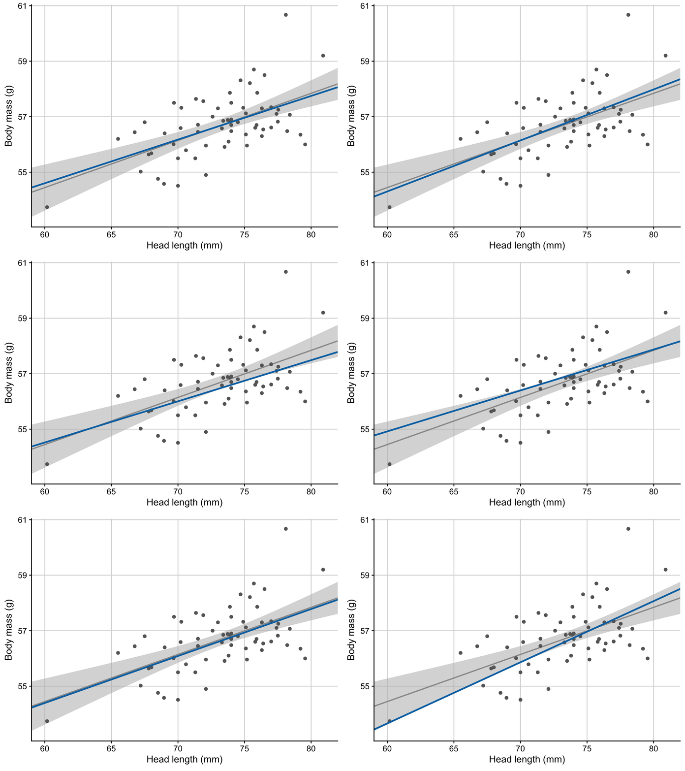
For a non-linear fit, the intuition gained from linear fits is not that useful. While the mathematics of linear and non-linear confidence bands is the same, the visual effect is completely different. Mathematically, every parameter in the fit has an error, and to explore the error surface means to find all the parameter combinations that have high probability density. Then you calculate where these parameter combinations place the response variable as a function of the predictor, and the boundary of that region defines the confidence band. This is the same for linear and non-linear fits. Because a linear fit never changes shape (it’s always a straight line), for linear fits we only have to imagine the line moving up and down and rotating. But for non-linear fits, as you change multiple parameters the shape of the curve changes as well, not just the location, and so the curve wiggles around as it sweeps out the confidence band.
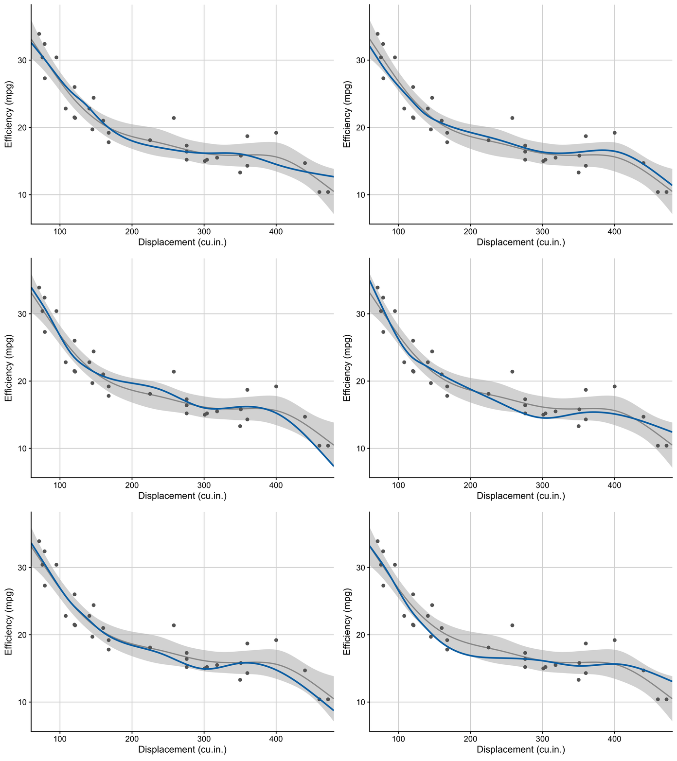
The consequence is that individual fits are much more wiggly than the confidence band suggests. The confidence band tells you that the fit would likely run somewhere in this region, but it doesn’t tell you what kind of path it would take. I have explained this hundreds of times and I still don’t quite know what to make of it. I usually tell people to not plot confidence bands on non-linear curve fits.7
In summary, while I’m not arguing that error bars don’t matter, I do think they are taken too seriously. There are occasions where not plotting error bars or confidence bands is a perfectly reasonable choice to reduce visual clutter. Either way, when you plot error bars make sure you always specify what they represent, and when you review other people’s work check whether they report what they are plotting. Finally, pay attention to whether people are confusing standard deviation and standard error, and if they do gently explain to them what a sampling distribution is.
More from Genes, Minds, Machines
Random seeds and brown M&Ms

My recent post about random seeds generated extensive discussions about best practices in random number generation. This is great. The more people are aware of the unexpected pitfalls the better. However, I received some pushback I found rather surprising. More than one person, and mostly people with extensive training in statistics, strongly argued tha…
Python is not a great language for data science. Part 2: Language features

This is Part 2 of my series on the limitations of Python as a language for data science. You can find Part 1 here. Please read it first if you haven’t done so yet. It provides important context.
I know, many working scientists do actually understand what a standard error is. But also, I’ve seen enough confusion about basic concepts of statistics that I don’t think we can just assume people have a complete grasp of them.
These topics are covered in introductory stats classes and books, so in theory everybody should know them. If you are feeling a bit unsure about the difference between standard deviation and standard error, you can read the chapter on the topic in my data visualization book.
For example, plotting the standard error is in essence the same as plotting a 68% confidence interval, and we just discussed that plotting the standard error is fine.
See for example the figure at the beginning of this post.
Honestly, I’m not entirely sure I can.
If you’d like to know how I made these animations, you can find relevant code here.
And if you’re showing multiple curve fits in the same plot the confidence bands truly become just noise.
I think an honourable mention is placing capital "T"s on top of a barplot. A bold statement against statistical pedantry and, well, common sense.
https://retractionwatch.com/2022/12/05/a-paper-used-capital-ts-instead-of-error-bars-but-wait-theres-more/
This feels like a critique of stats literacy...maybe? It seems like each field develops their own favorite ways to represent common experimental data sets, but not everyone conforms and so it's on both the author to clearly explain what they're plotting and the reader to...read it. And journals to be clear about what they want to see. People get really hung up on the stuff. I'm from a math background and when working in industry I always found the plotting conventions a little silly...on the other hand I can see the utility of consistent data representations for comparing results across studies and whatnot. Idk. I don't think I ever found that these types of decisions made any difference to the takeaway of some study (e.g. in something like which method was used to produce a confidence interval or whatever).